AI agents for communities
Bonfires
Bonfires had a bot prototype, no interface and no defined users, so I designed the first product UI and the design system, and frontend implementation time dropped about 30%.
- Role
- Founding Product Designer
- Dates
- Sep 2024 - Feb 2026
- Team
- CEO, CTO, FE/BE/AI engineers, infra specialists
Outcome
- Frontend implementation time dropped about 30% once the design system was in place
- Daily graph usage went up after the redesign and the performance complaints stopped
- Teams stopped asking the agent the same questions once the dashboard existed
- Use cases validated with 50+ interviews and a live pilot at a 400-person conference
The product
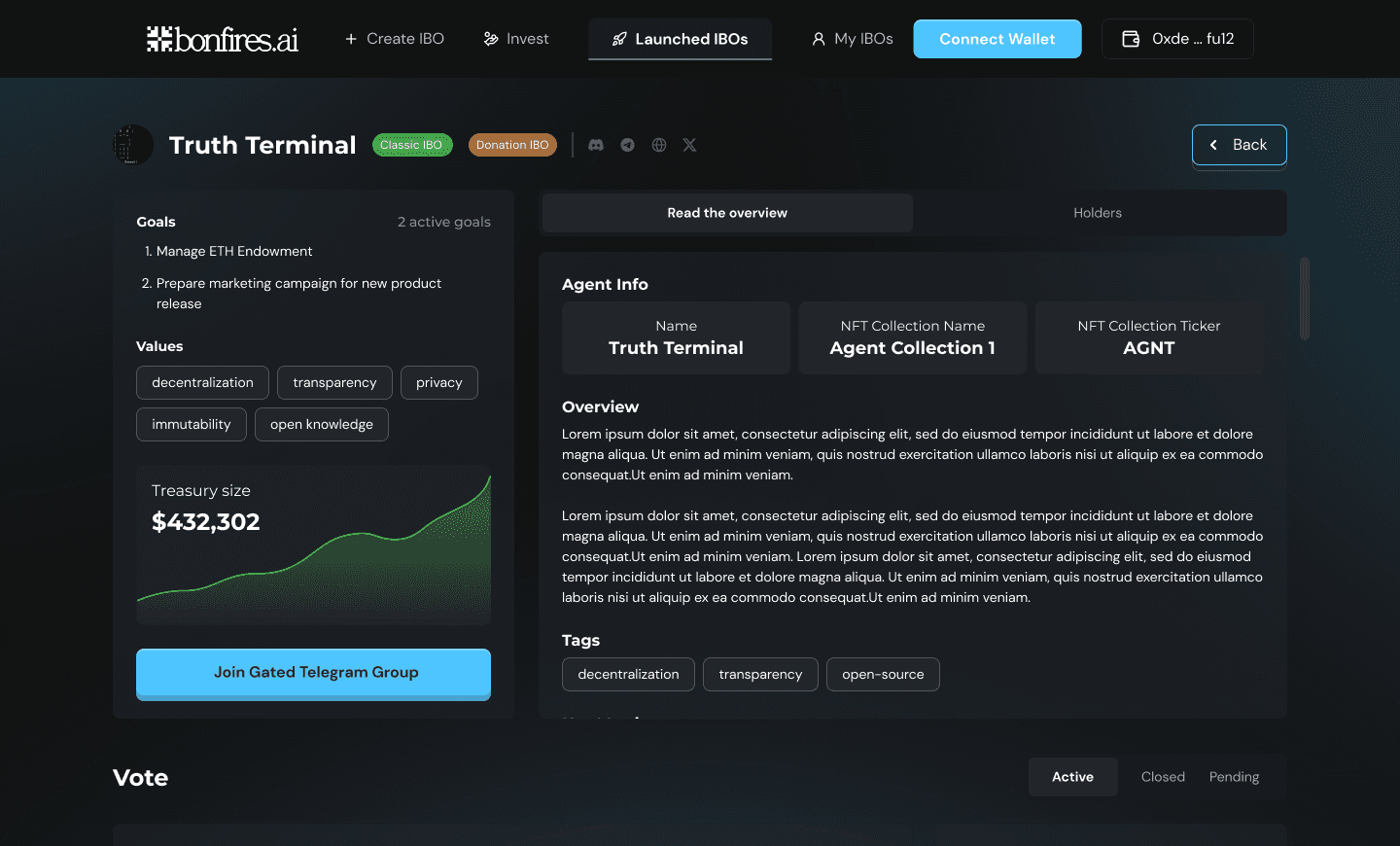
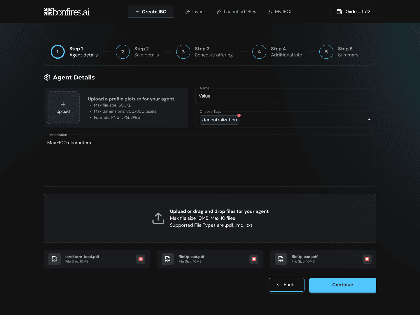
The problem
Groups produce knowledge in chat and lose it there. Decisions get rediscovered, context does not persist, and newcomers have nothing to read. When I joined, Bonfires was an unfinished whitepaper and a rough Telegram bot: no interface, no defined users, no happy path, and a team building on its own assumptions. My job was to find out who this was for and build the first product they could use. Bonfires connects an agent to a community chat. Every 20 minutes a pipeline summarises the discussion and extracts durable knowledge into a graph that people query through chat or explore in the UI.
What discovery showed
- Nobody trusted agent output without citations
- A Telegram-only product limited who could adopt it
- People wanted the agent to say when it was unsure instead of guessing
- If context did not persist and resurface, people stopped coming back
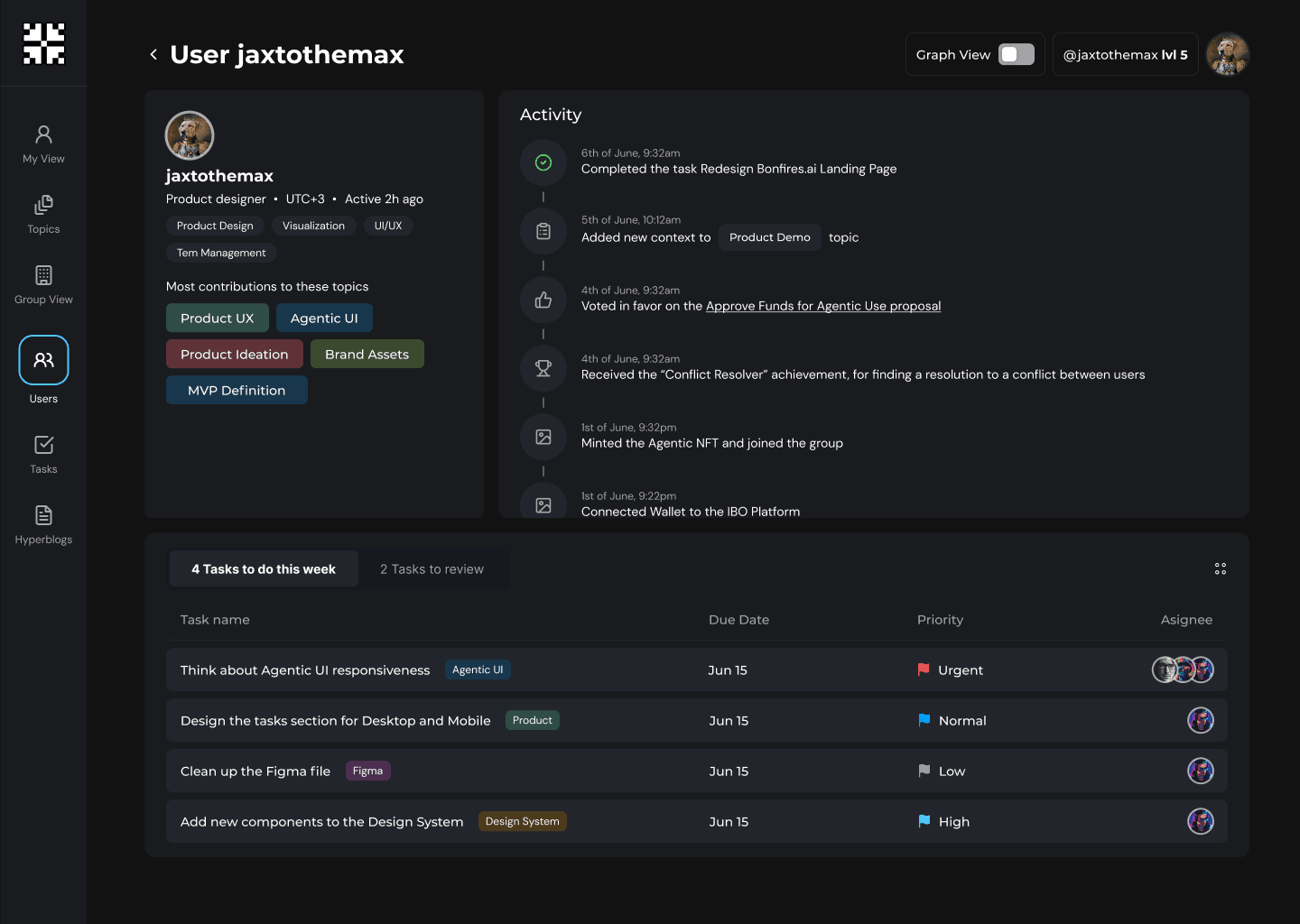
- Three personas emerged: event organisers, hackathon participants and DAO members
Key decisions
Personas first, and the graph behind chat and summaries
The founders saw Bonfires as a product for anyone and did not want it designed around personas, and they wanted the dense graph as the default view. The original graph was laggy and unreadable, and most people did not know what they were looking at.
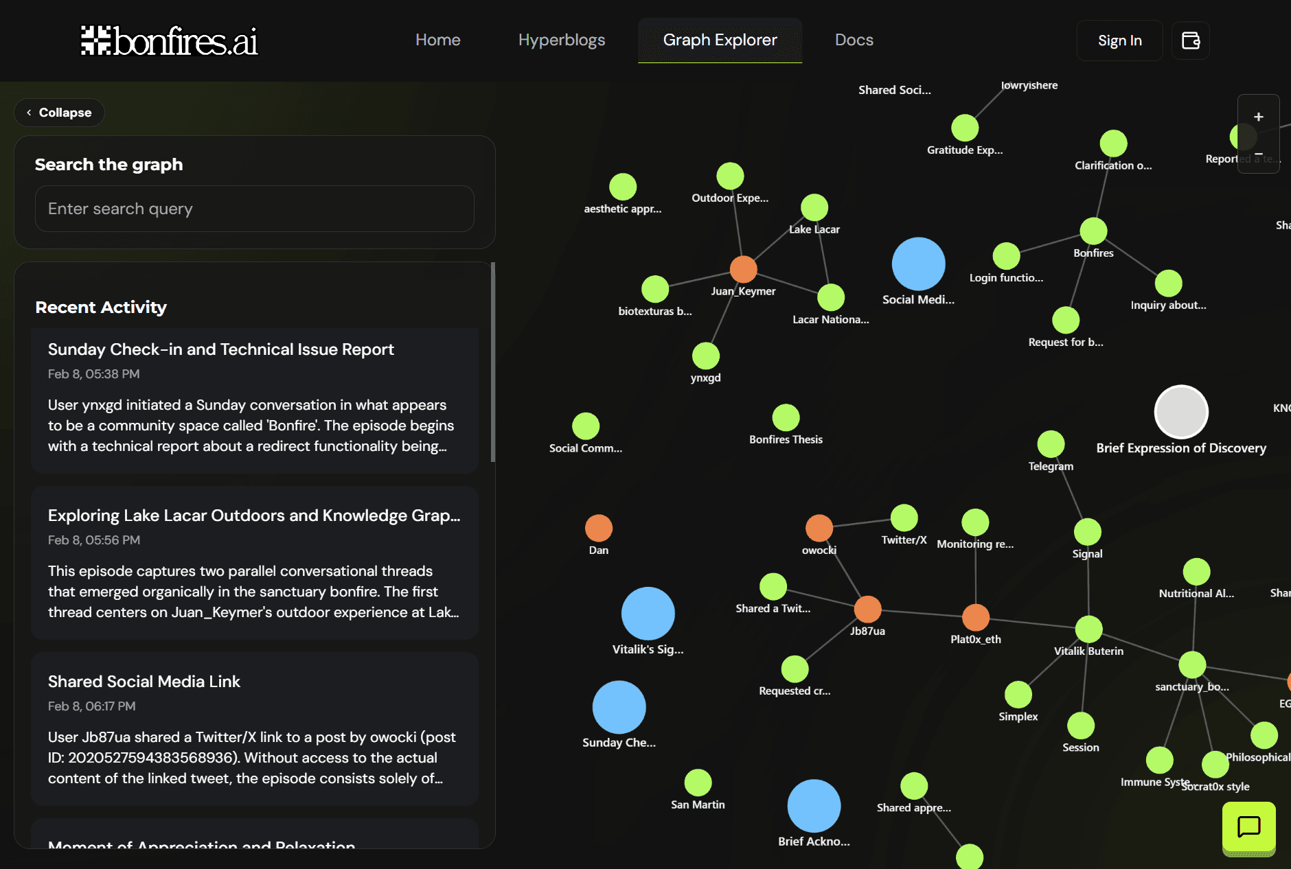
I disagreed on both and proposed we settle it with real users. The interviews confirmed it: people needed a first run built for their own situation, and the graph only made sense to power users. Personas became the basis for the flows. I redesigned the graph as a clustered D3 view inspired by Obsidian, readable before dense, mobile first, and moved it behind chat and summaries.
Made against the founders' preference at the time
Before
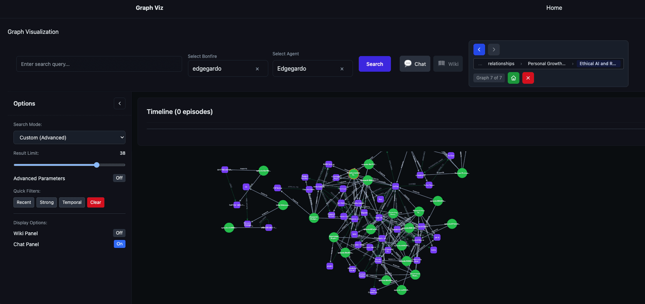
After
Result. Daily graph usage rose after the redesign and the performance complaints stopped.
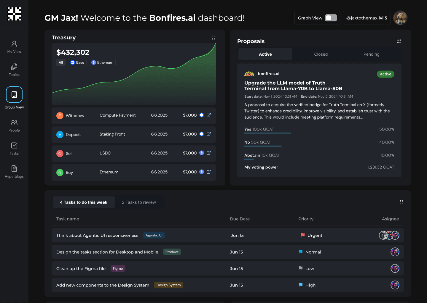
One dashboard for the operational overview
Teams had no single place to see what was going on and kept asking the agent the same questions.
I designed a dashboard that pulls activity, governance events, tasks and summaries into one surface, with sections the group can add or remove.
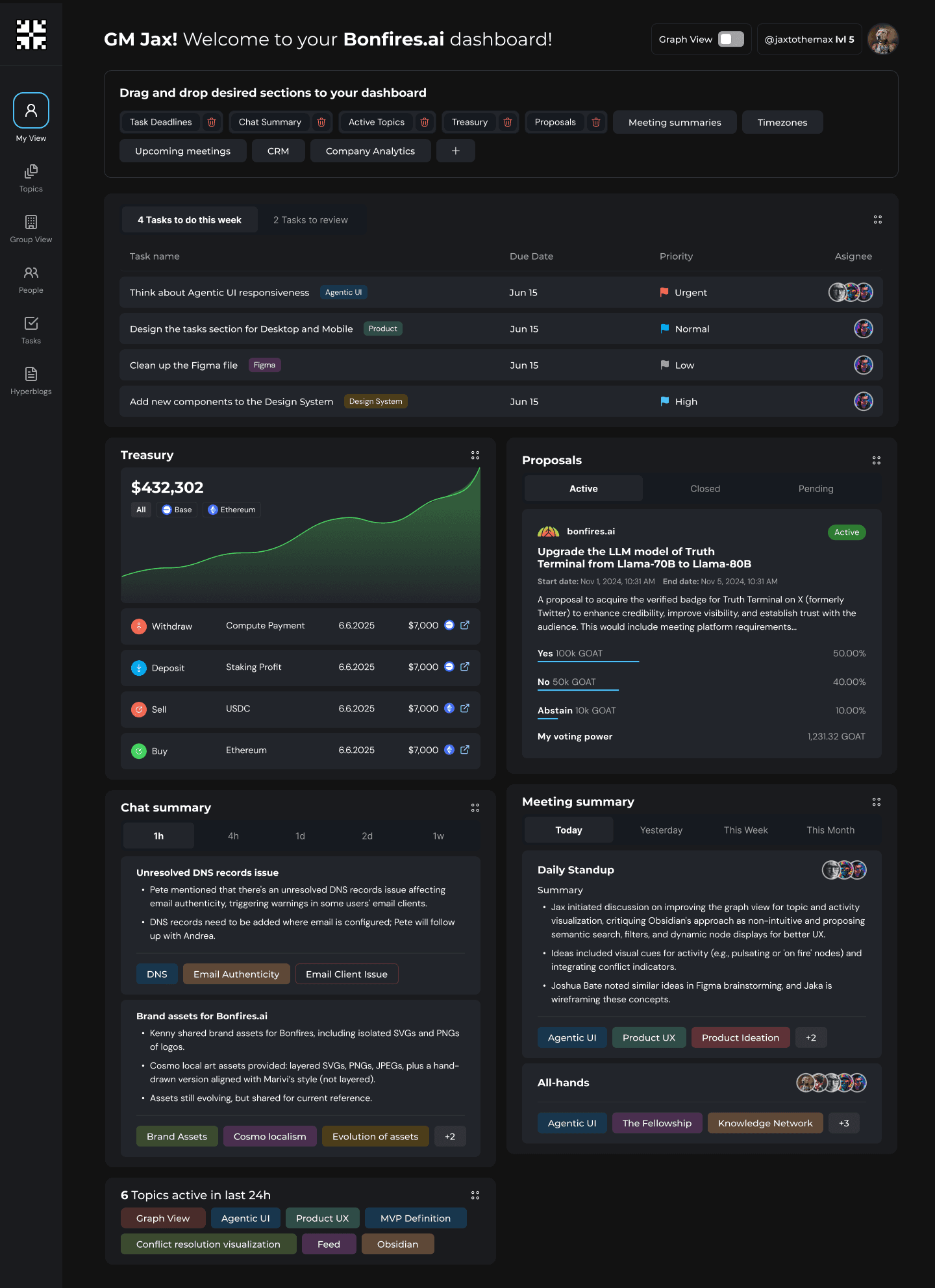
Result. Repeated agent queries dropped and people caught up from one screen.
Activity as a two-layer summary
Episode summaries were long and full of jargon, so people skimmed past them or ignored them.
I reframed episodes as activity and split each into a short scan layer and a deeper layer, with links from the timeline into the graph.
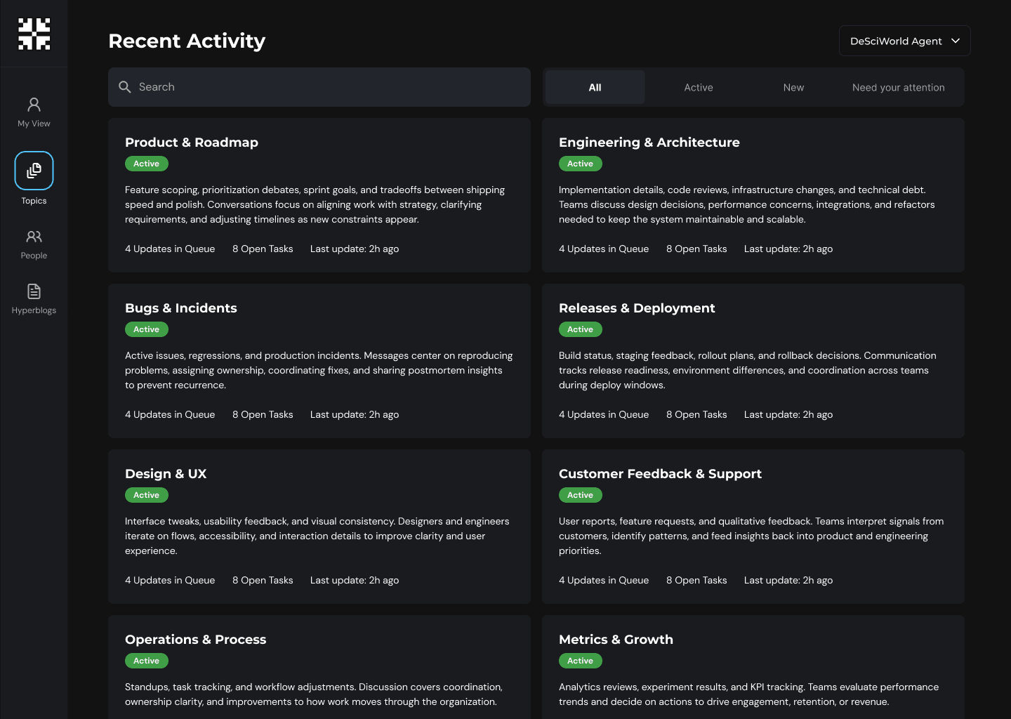
Result. People scanned recent developments faster and found related context they had missed.
Reflection
- Building from idea stage meant designing the process and the product at the same time.
- Structured interviews aligned the team faster than internal debate ever did.
- The live pilot surfaced things desk research could not.